- You are here:
- Home »
- Blog »
- Web Design »
- 4 Things To Avoid When Redesigning Your Website
4 Things To Avoid When Redesigning Your Website

Your business website should be an asset to your company, not a liability. When redesigning your website, there are 4 things you should avoid. Many poorly designed websites have one or more of these common problems that can impact your visitor’s experience negatively. Make sure you don’t make these mistakes by following these easy guidelines.
Broken Links
When you’re redesigning your website, make sure all of your links are working! This part can easily be overlooked when redesigning your website. Nothing could annoy the visitor more if one or more of your links are broken and/or linked to an incorrect page. One tiny typo or misspelling break a link immediately. Before the site goes live, double check everything. This should be standard behavior, but sometimes, it’s easy to omit things like this.
Even if your redesign means getting rid of old pages, you will need your web developer to set up permanent 301 redirects so that search engines no that your site isn’t broken.
Forward Thinking For Your Content
The information on your website will be read at all different times of day, year, and much further in the future.
If you’re not writing about news or something very timely, try not to reference a specific date (i.e. “Business is changing in 2010”). Make it so that your content will stay current and not stuck in the past. If you do feel the need to keep dates in your writing, make sure you keep track of updating them when needed. When using years, make a note every December to go through your site and make those updates.
To keep your content relevant, don’t include a date or trivial matter that refers to the day when the content was published. For example, if it was a rainy day when you wrote your blog, don’t mention that in your writing. When someone looks back on to that page in the future, it’s easy to miss the date of when the article was posted. It could be rain-free and sunny on the day your website is read and this would lead to confusion for the visitor.
Don’t Hide Your Content
If you’re posting weekly or daily blog articles on your website, don’t restrict access to the visitor by making sections of your website “premium” or requiring membership access (unless of course it’s a membership site).
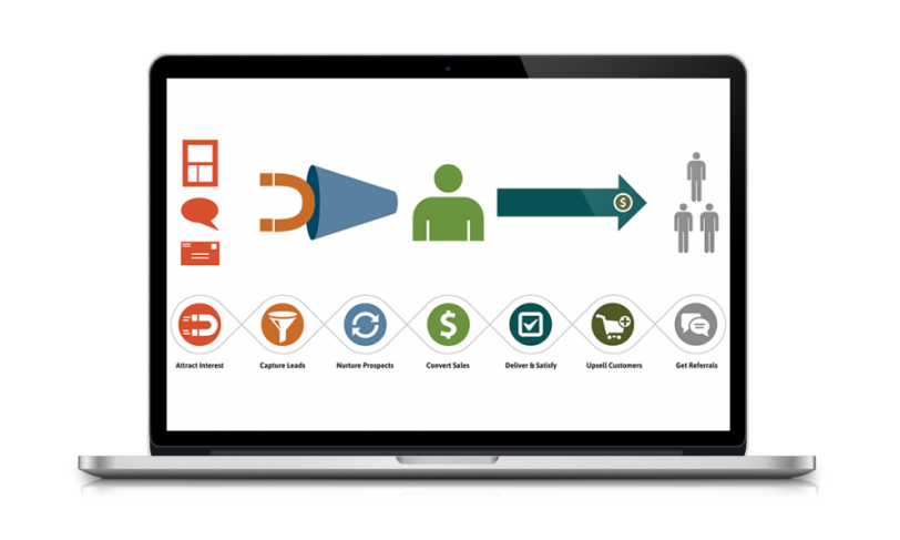
People will see that and just turn away from your website, hitting the back button and going to your competitor’s site. Information should be readily accessible to your visitors. After all, you want your site to be a source of quality information for your visitors so that they become subscribers, and enter into your marketing funnel.
Not only will this improve your lead generation and customer retention, it will also help with your website’s bounce rate.
Speak To Your Customer
 Speak to your customer, and not about your business. Instead of trying to sell the product or service, you want to tell the value. Keep your website focused on the customer’s problems, needs, and solutions. Your business needs to be the customer’s solution. By emphasizing this on your website, visitors will see that it’s not all about you.
Your website should be customer centric, not your-business centric.
Do You Need To Redesign Your Website For Maximum Optimization?
If you are in need of a website redesign, we offer several packages to best suit your company’s needs.
Click here to see our web design packages and schedule your free assessment >>

