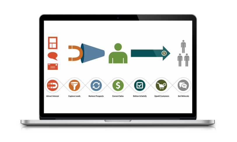
When designing a website, there are 4 elements that can immediately grab the attention of the visitor. Implementing these 4 elements on your website will help to generate leads. For your website, you want to have a call to action graphic, home page video, a personalized website experience, and a modal box.
Call To Action Graphic

Tresnic Media CTA
CTA’s should be able to immediately garner the attention of the visitor to your website. To have your CTA noticed quickly, it first needs to be easily viewable. By easily viewable, the CTA should be in plain sight to the visitor. When making your graphic, it should be contrasting. If your graphic is contrasting in some way to the rest of your site’s design, it will be stand out more prominently.
CTA’s on your website should include a visual element that can strengthen its message to the visitor.
Home Page Video

Explainer Video On Impact
Another effective element in maximizing your potential for your website is to have a video located on your home page. This video could be an explainer video that explains what your business does and what it provides for the customer. However, many website visitors are turned off by an auto-playing video so this is something you should avoid. You can improve your website’s bounce rate by cutting out distractions.
Personalized Website Experience

Personalized Website Experience At Sweetwater
Customer retention should be on your list of priorities for your websites. How can we hold on to our existing customers? You can incorporate login messages that include the customer’s name, send your customer a happy birthday notification, etc. Even little things can start to add up. Getting personal with your customers is a great way to emphasize on the “service” part of customer service.
Modal Box

Tresnic Media Modal Box
The use of modal boxes on your website can either be effective or ineffective depending on how you use it. A poor use of this feature would be having it as a pop-up every time the visitor clicks on a link for a different page. You will put yourself in a disadvantageous situation by actually increasing your website’s bounce rate. The one thing you don’t want to do is annoy your potential customers with a constant barrage of pop-ups. However, the most effective way of using a modal box would be on landing pages that encourage people to sign up for your newsletter or to download content. The modal box will then become a CTA itself. By timing and limiting the use of modal boxes to certain pages, you can expect to dramatically increase your conversions.
Do You Need To Redesign Your Website To Grab The Visitor’s Attention?
Tresnic Media has 3 web design packages to choose from that can fit the needs of your business.
Click here to see the packages and get your free website assessment >>


